Service Desk SDK
- Microsoft
- 2018
Service Desk SDK is a documentation site used for development of Service Desk. It contains code samples, design samples, and API information.
The Service Desk Source Development Kit has traditionally been aimed at developers as documentation on programming various aspects of the Service Desk application. But because Project Managers and Designers didn’t have documentation of their own, they were forced to use the same site. Ultimately I needed to bridge the language gap between designers and developers. They were both referencing the same component, but looked at each one in a different light. There were also a few outstanding issues with the current SDK site:
- There’s no where to search for keywords and find what you’re looking for
- The getting started section lacks proper documentation for both developers and designers
- There are no real examples of code implementation
- The vocabulary and structure is not easily used by Project Managers and Designers because it’s aimed at developers
- There was no way to tell when new content had been added, or controls had been changed
Role
UX Lead – I lead the surveys and discovery sessions with the SDSDK team at Microsoft. After which I was able to compile a list of new features and improvements to tailor the site for developers, designers, and project managers. The challenge here was finding a UI medium for all roles, and enable them to collaborate on content without having to know much about the other’s field. Finally I created design comps for the redesign and lead our development team in incorporating the changes/additions.
Process
Survey
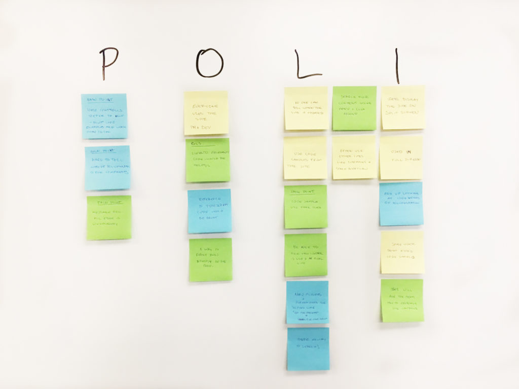
The survey consisted of questions that would dive into the every day use of the application and in what setting they used it. I used Survey Monkey and was able to view analytics each time a response was posted. I took the feedback and ran it through an exercise called POLI. Problems, Opportunities, Limitations, and Influences.
The SDK was never meant to be responsive, but the kind of screen real estate they often used it with was important. I also included a section that allowed them to simply make any recommendation they could think of. Any commonality I found here could spark a new feature for the update.
Information Architecture
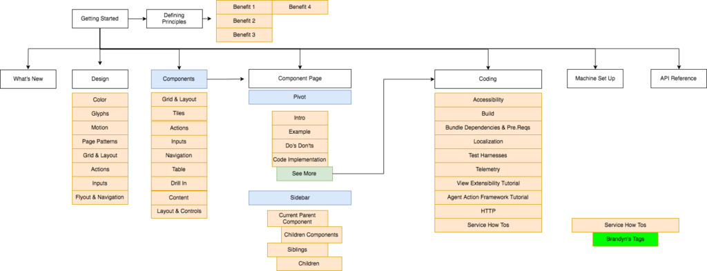
I knew that in order to accommodate the 2 new roles (designer and project manager) I would need to organize the site to be digestible by 2 very different disciplines. Through the information architecture diagram, I discovered that components were where I could bridge the gap between design and development. This would be the only shared section on the site and would include UI to toggle between each preferred organizational structure.
Design Comps
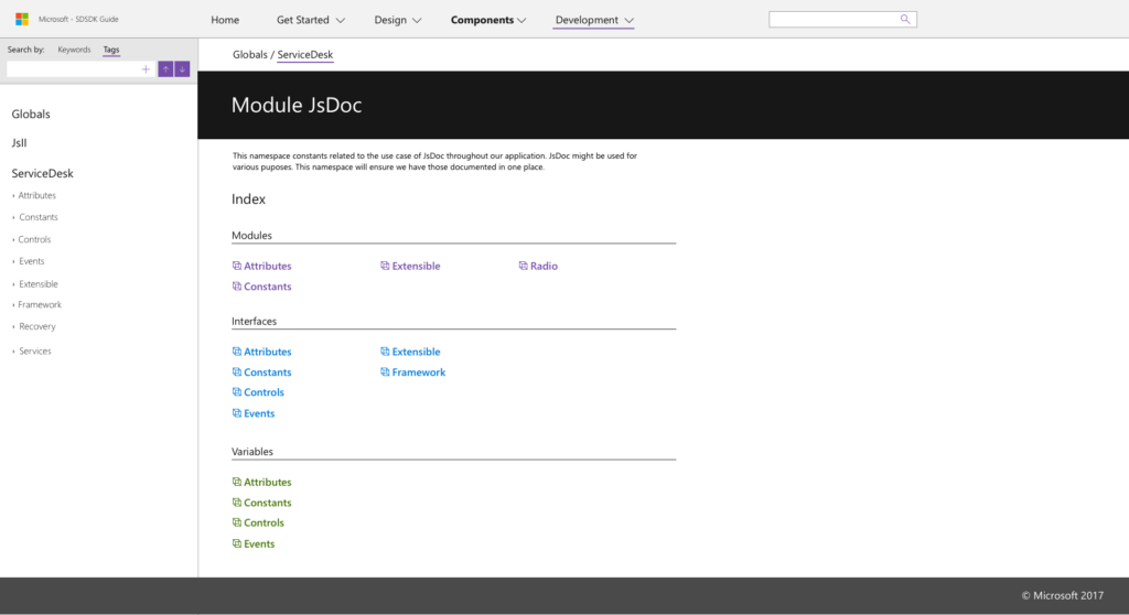
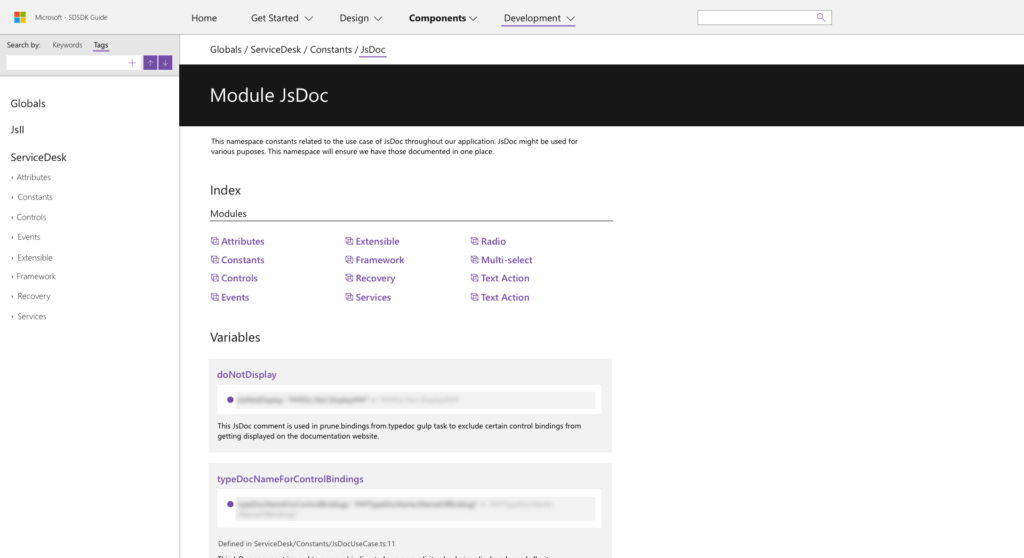
I started by just creating wireframes, but due to already having the styles influenced by the Service Desk site, it was easier to just use them and continue to the design comp phase.
Homepage
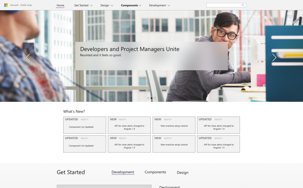
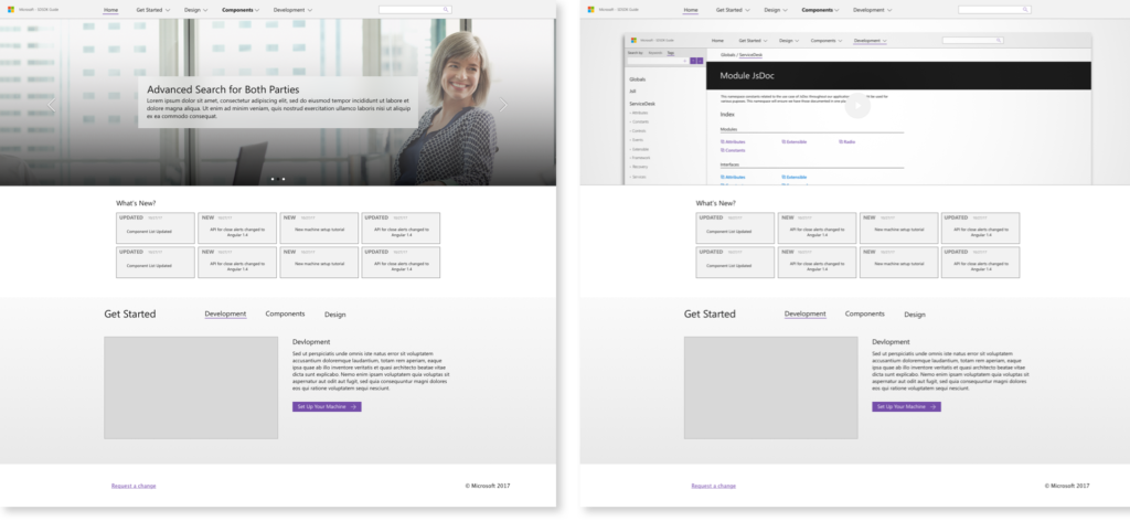
The homepage would provide an overview of the entire site. Such as new features and how to use them through a tutorial video. New components or edits to current ones, an introduction to the Design Principles of Service Desk design, a getting started section for developers, and some general information on Service Desk itself.
Components Bridging the Gap
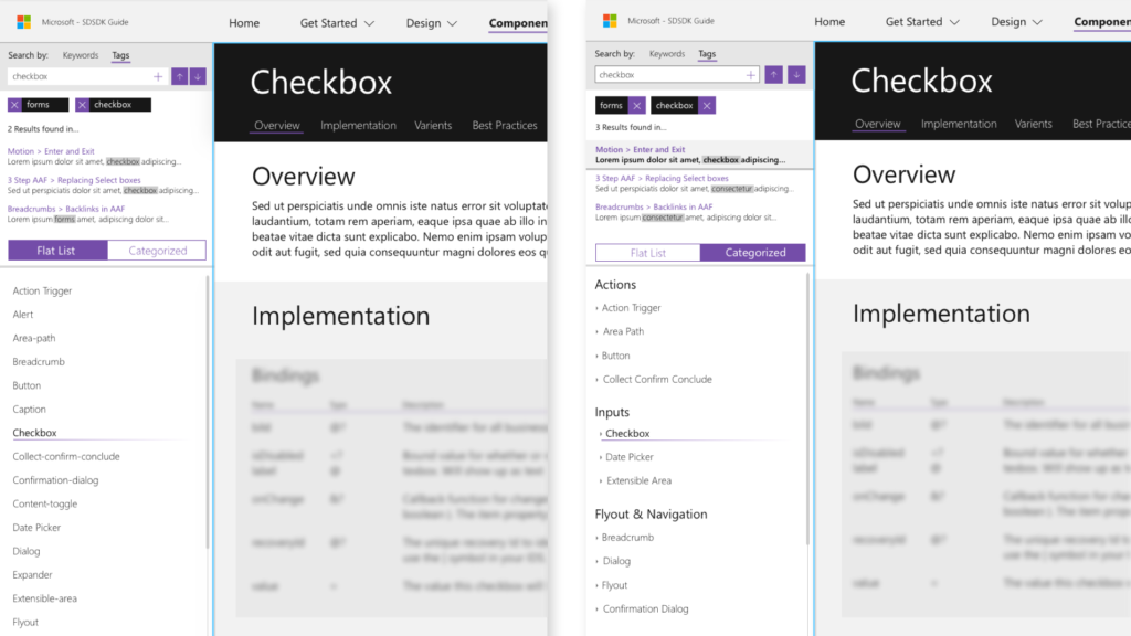
I used the components page the bridge the gap between design and development. This was a section that both roles needed to use. Designers could view “Do and Don’ts” and see related controls, and developers could view code samples and bindings. The toggle for organization of these components was crafted from feedback I received in the survey.
Gathering and Implementing Content
Service Desk uses a lot of components from the Microsoft Web Framework, so much of the new content I needed for the designers could be found here. There are small differences and to solve those I consulted developers from the SDK team and my own team who worked on designing components fro Service Desk.
Major Accomplishments
- Through sending announcements to the right people on the team and friendly reminders in Microsoft Teams, I received > 90% response rate on the survey and received feedback from all roles influenced by the site. This gave us really meaningful results that we could address from all 3 disciplines.
- Worked with developers to create UI that was familiar to them and resonated with other programs they were already using. I saw this as an opportunity keep the current users of the site happy, and bring some more advanced features to the SDK that would really improve the sites usefulness.
- Bridged the gap between design and development disciplines.
Toughest Challenges
- There were very distinct differences in how developers and designers organized content such as UI components. Designing a workflow that would allow the project manager to toggle between each organizational structure in the same application was challenging.
- The meetings consisted of designers, developers, and project managers. Getting all three to sign off on a design required clear justification, often referencing survey feedback to convince them I was designing the best solution.
Key Take Aways
- Because project managers need to work cross disciplinary a tool with content organization features like this can have a large impact on their ability to understand both sides.
- UI is the bridge between design and development
