Service Desk
- Microsoft
- 2017
Service Desk is a Microsoft tool used by their customer service experts to create, manage, and work support cases. Day to day, the tasks are very repetitive and the team at Microsoft saw an opportunity to enhance the experience using motion design.
Provided by the Microsoft Design team – https://www.microsoft.com/design/fluent/
Role
Creative Lead – I was brought in after a lot of the UX work had been completed to explore how motion design could improve the readability and overall experience of the software. I developed multiple concepts that incorporated the new Microsoft design language, Fluent. I was later used as a Design Integrator to develop and merge our UI changes to their current application.
Project Description
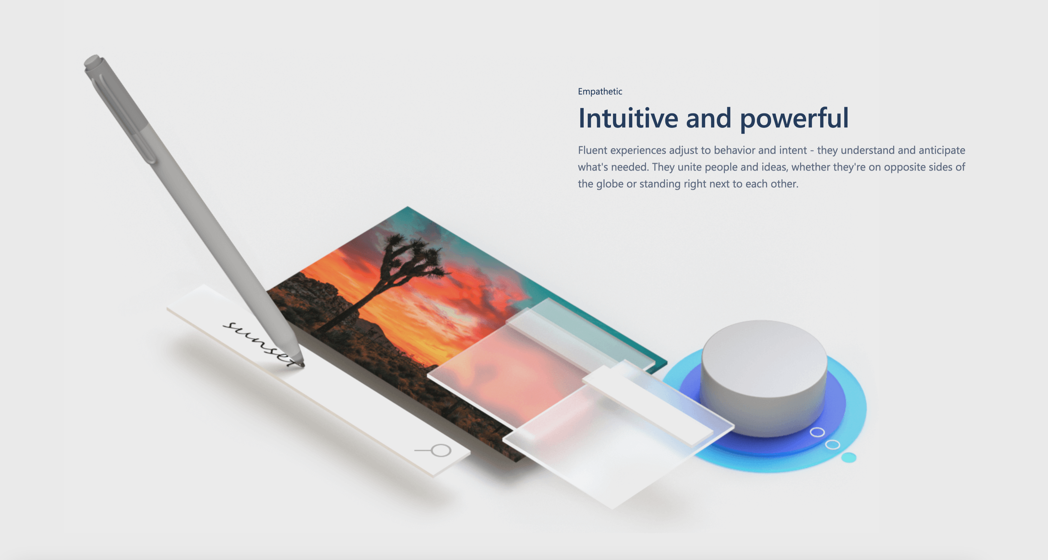
The requirements were to use motion design and other Fluent principles to make the Service Desk more interactive and efficient for the agent. At the start of this project, Microsoft hadn’t released Fluent yet, and it was called Project Neon. There were limited examples available, but the Microsoft crew turned me onto this video that showed the high level visual approach.
Process
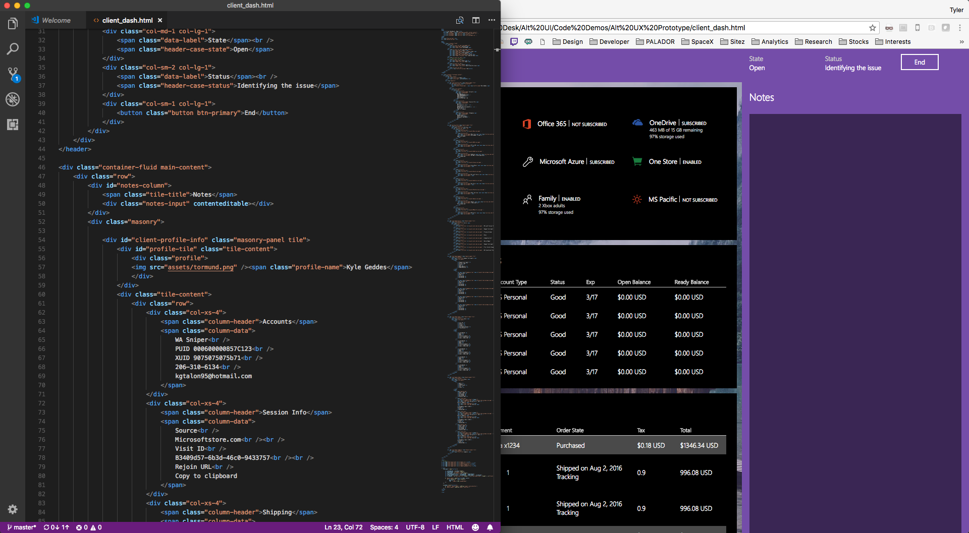
I took wireframes created prior to me starting, and translated them into Fluent design visuals and animations. I used Sketch to create the visuals, and prototyped them with Principle.
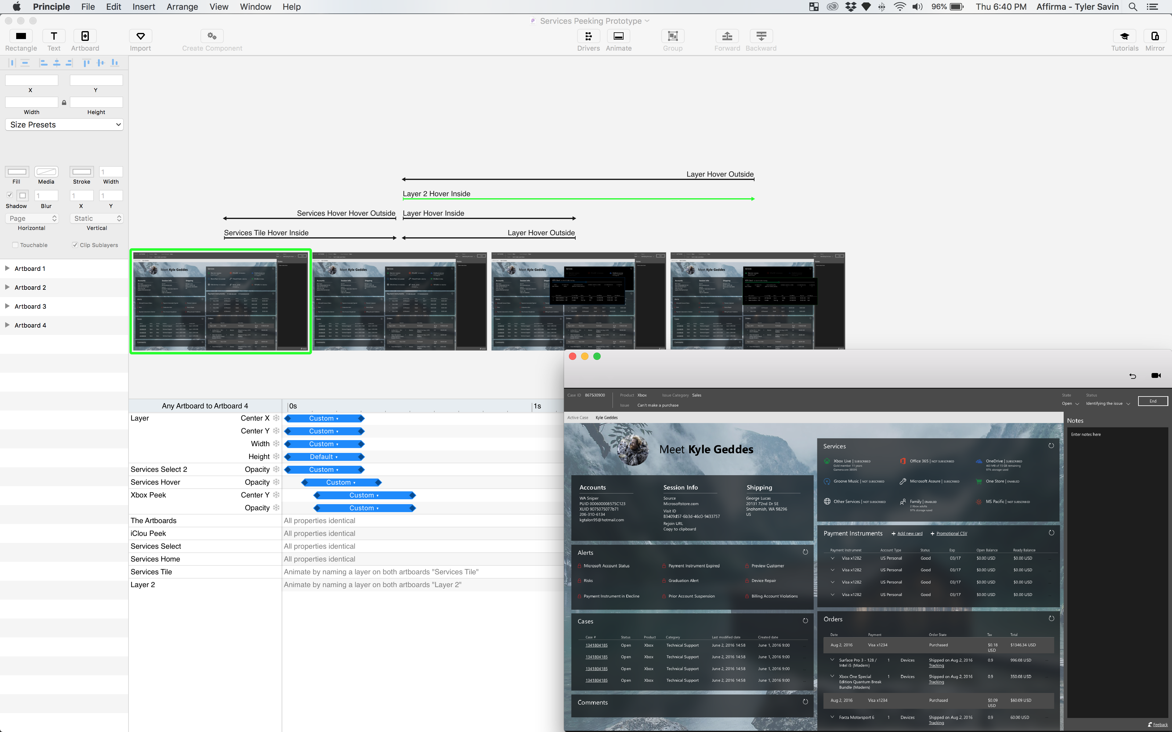
At this time much of the Fluent documentation that was available, referred to the MWF website which had been used for pretty much every modern Microsoft application to date. I often referenced this site for information on easing curves, the differences between similar components, and accessibility standards.

Enter and Exit Animations
It was apparent that after adding animations, there was a significant addition to the time it took for elements to appear. Since this was counter productive to our mission, we decided not to simply reverse the animations for clearing elements on the page.
This gave us the best of both worlds. We can make the experience more engaging and save the agent time when leaving pages. The easing curve is the same, so the experience feels cohesive.
Creating a new follow up task
Notice the final “OK” button is only visible after the action has been confirmed and completed by the server. This validation removes the question “is it okay to continue?”
Remove Useless Confirmations
There were many times within the experience where the user was asked to confirm and action, or take additional actions. In some scenarios, the answer was always “yes”, therefor there was no need to prompt them, and make repetitive tasks take longer.
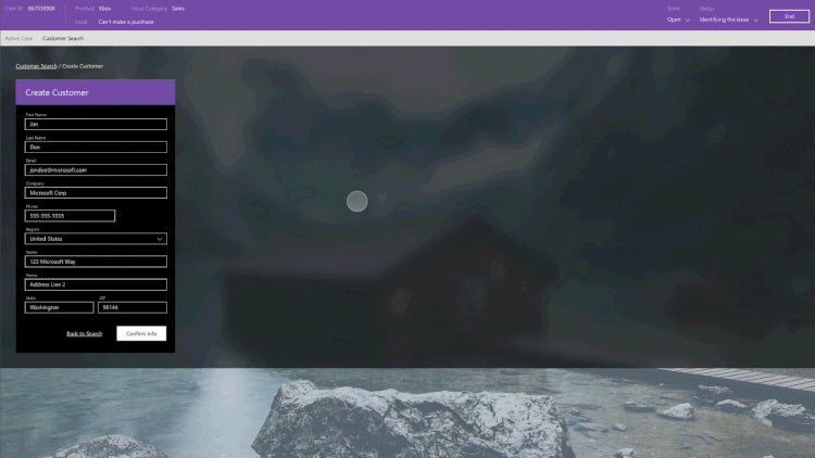
This task used to be 4 steps, the 4th asking the agent if they would like to add the customer to the case. Since the answer is always “yes”, I changed the language on the third step to include adding the customer to the case automatically. This removed the need for a 4th step. It’s a small difference that adds up over a large organization.
Hover and Reveal
I found that motion can give certain interactions a physical feel to them. For example, elements snapping in and out on hover gave visual feedback and felt bouncy.
Code Handoff
Finally I had to get the development team onboard in order to satisfy everyone in the room, so I coded a proof of concept. Using SASS, Javascript, and CSS3 animations I was able to prove that this code was not only possible, but that they didn’t have to figure it out because I already did. The conversation quickly turned to having my agency do the development work on this project!
Major Accomplishments
- I adopted principles from Fluent into a more data dense enterprise solution.
- I was able to shave seconds off of repetitive tasks that added up to major savings in operational costs.
- Developed custom code to implement the motion design into the web app.
- After proving I could code this, the Service Desk team hired my agency to implement the changes.
Toughest Challenges
- Much of a customer service agents’ job is completing many repetitive tasks behind the scenes. So adding animation to these tasks would actually add time to each one. Our meetings quickly became conversations on finding the balance between “looking nice” and value added.
- Changing the application drastically in one large update would require the agents to relearn many tasks they were once very efficient with. Motion can have many implications, especially if it’s unexpected.
- I was having a hard time getting the devs on board, because there was a lot of new CSS3 stuff happening with the animations and acrylic textures. My concepts were deemed too large of an effort, so I had to show a proof of concept by coding it myself.
Key Take Aways
- It was easy to add animations to interactive elements throughout the application, but doing so actually extended repetitive tasks due to the time each animation takes. Learning why to use motion and ultimately how to use it sparingly but meaningfully.
- Reducing mere seconds to repetitive tasks, really add up across 10,000 agents. Equating to a large savings immediately.